A new look for a growing roadmap

Stay up-to-date with the latest from Capchase
Today we’re excited to launch an updated design style for our brand.
Capchase launched 3 years ago with a mission to improve funding for founders. Through our capital product, Capchase Grow, we’re proud to have worked with thousands of companies, making over $2.5B in funding available and playing a small role in their growth story.
We’ve since expanded our product roadmap to include Capchase Pay (SaaS contract financing) and, as of today, Capchase Collect: an automated invoice collection tool that helps finance teams make unpaid invoices a thing of the past.
But while our tech was becoming more sophisticated, our visual brand needed to catch up.

There were a couple of specific reasons we wanted to update our visual style. Firstly, our old illustration style used a gradient “swirl” pattern which was hard to replicate in print. If you know Capchase, you know that we like to show up at events in a big way – so off-brand booths were a problem we wanted to fix. Secondly, going from a single-product environment to multi-product environment meant that we needed to create a design system that facilitated ‘sub-brands’. Most importantly, we wanted to create an identity that felt simple and cohesive – and one we could grow into as we expand our ecosystem of SaaS revenue tools.
Capturing the need for speed
A core tenet of all of our products is reducing time to revenue, and we wanted to apply a sense of speed to our design style too.
Fun fact: if you look at the absent space in our logo, you’ll see a ‘fast-forward’ button. We love this intrinsic meaning so we decided take it a step further, keeping the same logo for this brand refresh and extending the same composition to a new suite of illustrations:


Each illustration is built with solid, filled rectangles and angled “shards”, using the same angle as the Capchase logotype. We chose a modular design so that we could apply different iterations for different uses: in web, marketing assets, product materials and more.

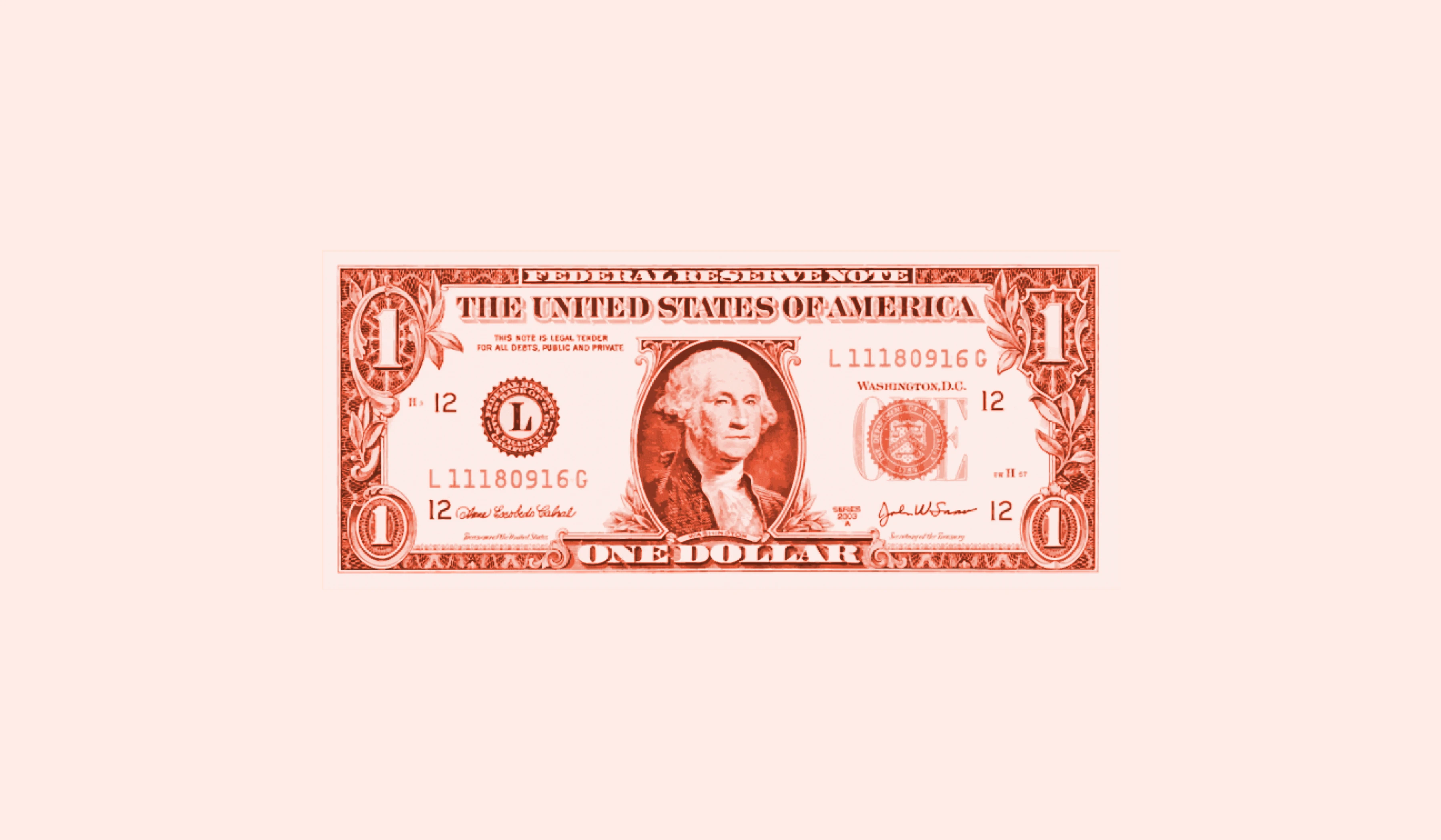
Another subtle element incorporated in our new style comes from our roots in fintech. Drawing inspiration from the intricate guilloché patterns commonly found on banknotes, you’ll see these delicate, repetitive engravings featured throughout our designs.
Historically, guilloché emerged as an anti-forgery technique, we thought this was an apt reflection of our own commitment to dependability and building trust.

We’ve decided to keep a vibrant color palette which is a nod to creativity and innovation (who says B2B has to be boring). We’re looking forward to working with these across our marketing channels, content and events - together with a brand new website which better explains who we are and what we offer the SaaS community.

Finally a word on our creative partner: we worked with an independent digital designer, Sebastian Graz. Seb has more than a decade of experience delivering branding work for a wide range of global clients including Volvo, Canon, Framer and Saatchi & Saatchi – and an impressive ability to translate abstract ideas into beautiful designs.
You can learn more about Capchase and how we can help your company access revenue and scale faster here.


